The Biggest Issues I see in architecture Portfolios
In my 12+ years in architecture I have seen my fair share of portfolios, some amazing, some absolutely shocking.
I myself have produced some good ones and bad ones, but I have also had students send their portfolios into archistudentnotes for me to review and at one of my last practices, a shared company email meant that everyone could see each and every job application that came in.
I think it is fair to say I know what makes a good portfolio and also how employers react to the different elements that make a portfolio.
Whilst I do obviously judge a little, I do not blame the student or assistant because you are not taught how to produce portfolios suitable to send to professionals at university.. and if not then.. when are you meant to learn?
This post is to highlight elements you should definitely avoid but first, let’s look at different types of portfolios. I’ll keep it simple for this post, you have a short portfolio and a long portfolio.
I hope this are helpful and if you have anything else to add, please write them in the comment box right at the bottom of the page. It would be very helpful for everyone else reading this too!
Enjoy! :)

TYPES OF PORTFOLIO
I’ll keep it simple for this post, you have a short portfolio and a long portfolio.
The Long Portfolio
A long portfolio is the one that you keep on your website for people and potentially employers to browse.. you do not under any circumstances (obviously unless asked) send this portfolio via email.
The file will either be far too big to get into the practice email inbox anyway or the quality so low they’ll open it and wonder why you wasted their time and your own.
The Short Portfolio
The portfolio you email is the short, snappy, ‘this is me in 10 pages or less’ portfolio. It should showcase all of your relevant skills, and perhaps some fun ones to show you have a personality that transcends architecture, it should be well presented, clear, clean and easy to understand.
In and effort to make this post short and snappy, but also valuable, here are 5 of the worst things I have seen (and also myself done) in architecture portfolios.
Crowded Pages
Throughout your architectural education, you will have been told how important it is for your drawings to breathe on a presentation panel, and if not, I am telling you now - let them breathe! Allow each drawing or textbox its own space on your page, without that space each element you add will be a huge distraction from the other drawing or textbox that you have placed mere millimetres away.
Yes, this will mean you can’t fit as much on the page but this just means you choose your best work and do them justice by allowing the viewer to focus on them as individual pieces of work.
Trust me, if you choose your best work and then clutter the page with all of it, employers will look at the page and assume it’s not as good regardless.
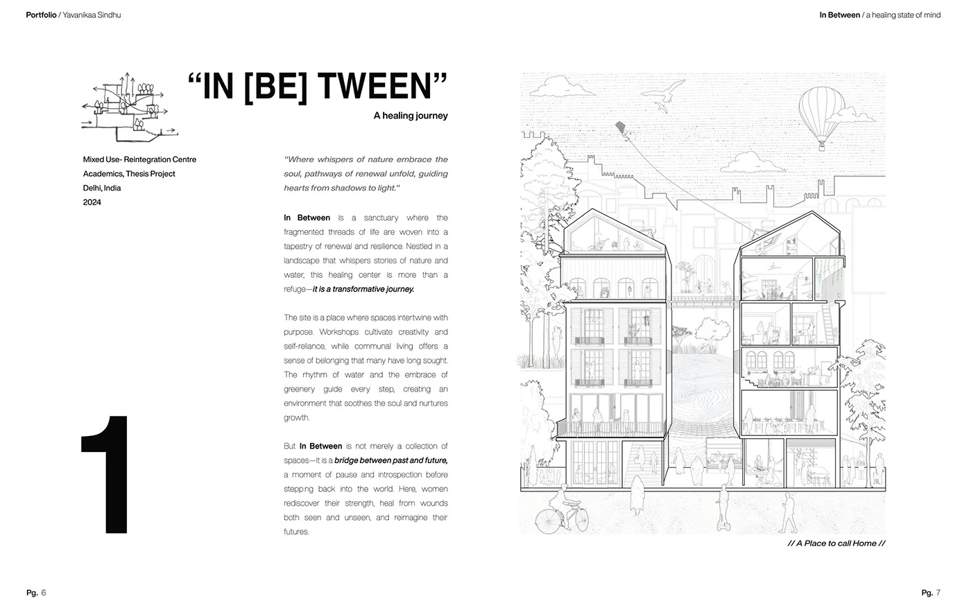
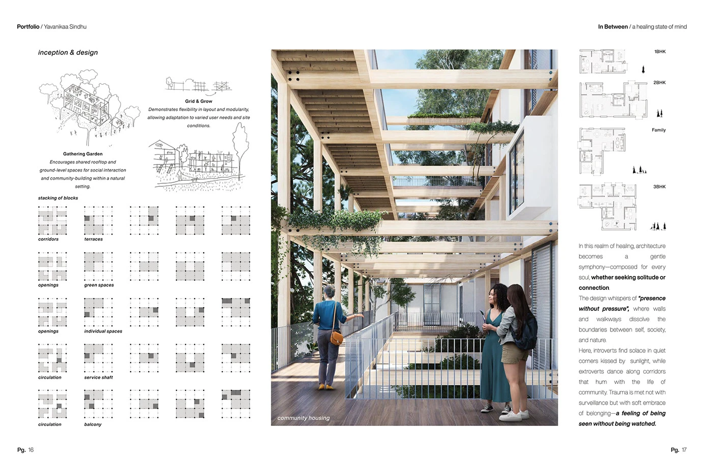
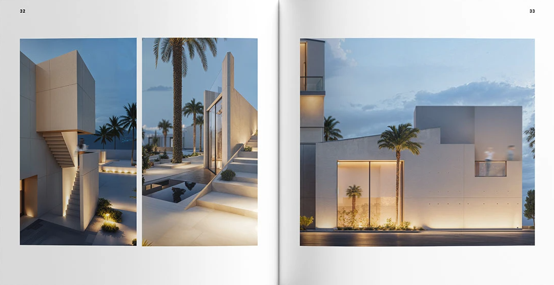
An excellent example I have found on Behance is this portfolio from Yavanikaa Sindhu. A grid has clearly been used to arrange the different elements and this has allowed each element to stand alone.

Mix of Paper Sizes
This unfortunately shows a lack of attention to detail and suggests that you didn’t not check your document prior to sending it or worse, you checked it, saw that the page went from A4 landscape to A3 portrait and went ‘yeah, that’s good’. No. Do better.
Digital or printed, consistency is key - all pages should be the same size and orientation. You might, and I say might with a get away with a detail on a bigger size page but try to avoid and only when printed.
Your hopefully future employer, should be able to very easily scroll through your portfolio without zooming in and out or adjusting, well anything.
Too much writing
This is from what I have seen and done in my own portfolios. I love writing and I used to think that everythingI was writing was super important which meant that I struggled to reduce it.
This is a note to myself and to you, not everything you have written is important or necessary to explain a point or design concept or project. Keep things brief, a couple of sentences at a time, use bullet points where you can and diagrams if you can as well.
Architects are very visual people and often when looking through job applications, they have very little or in fact any inclination to read half a page on why you have placed the staircase in that particular place. Shot and snappy. What will draw the vast majority in will be your images so pair with only necessary text!
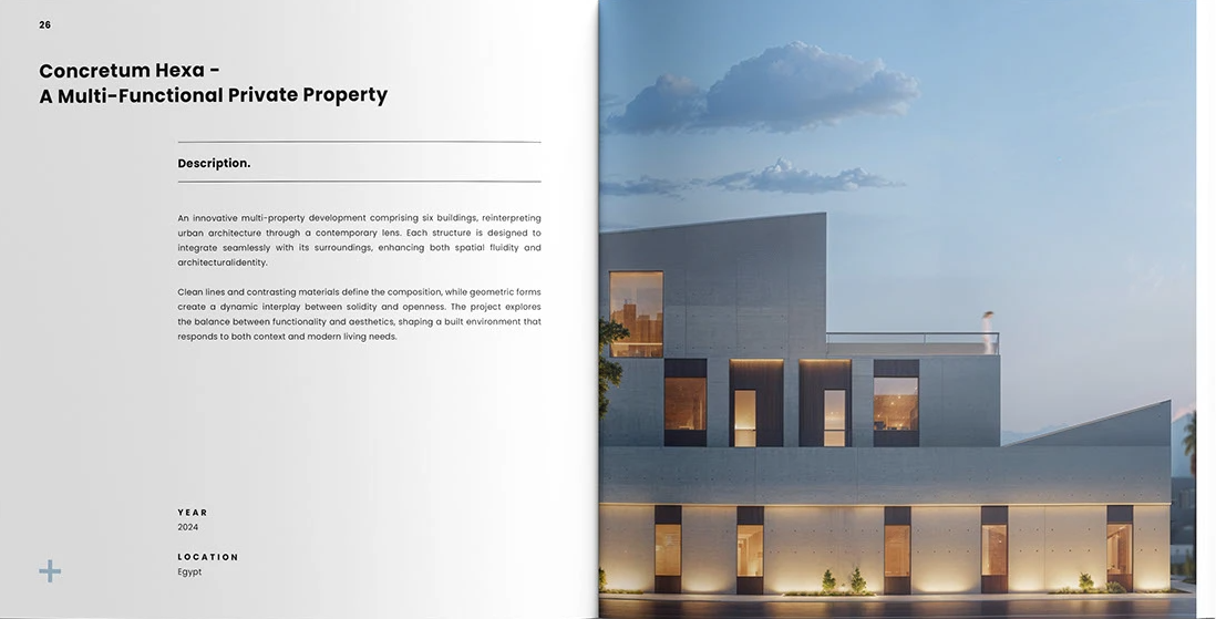
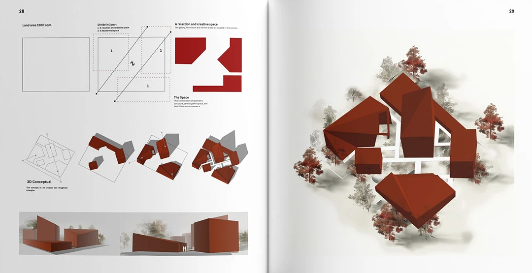
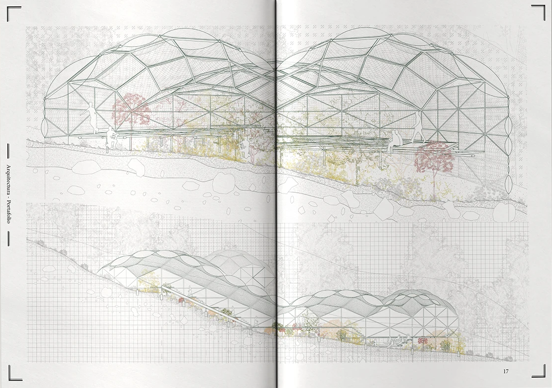
Another excellent portfolio below, this time showing how you can showcase a project without much writing at all! These images do really well to show the development of the project.
Incorrect PAGE ORDER
There is an art to the order of the work in your portfolio. Same say that it should start and end with your best work as it gives a very good first impression and then leaves them with a good impression at the end.
I say that
1. all your work should be worthy of your first page and,
2. it really depends on the firm you’re applying for and their style so try and cater to each firm.
What I mean by that is, if the firm you’re applying for is big into hand sketches, not so much renders, then start with a hand sketch to get them interested but then blend a render or two into the mix to show you can do it.
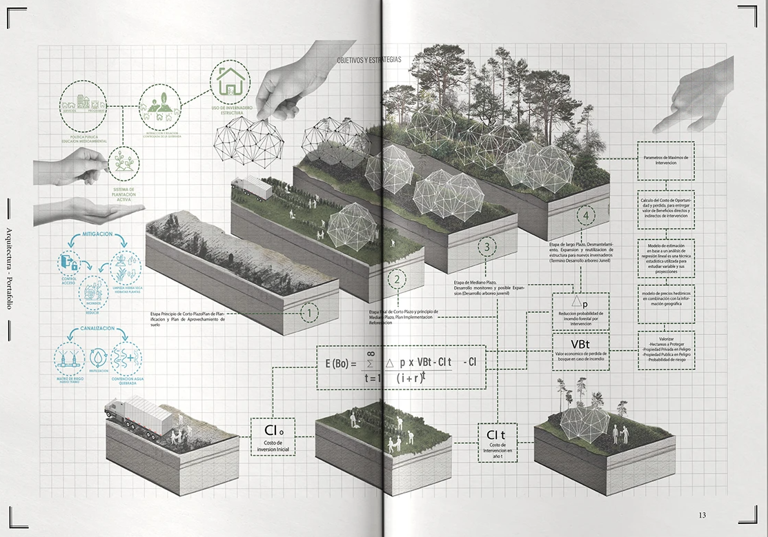
An example portfolio from Borja Lefort Cabezas where the vast majority of the pages could be used as the ‘showcase’ image for the project.

Lack of context
Too many portfolios jump straight into the main body of the project without explaining background information: What was the brief? What was your role? What type of project is this? What skills did you apply? What tools or software did you use?
Without this information, especially when an employer is looking at multiple projects, it can be quite confusing. Architects want to know context. This is particlaurly helpful when your stunning draiwng or development sketch makes the want to stop skimming through and really get into your project. This is hard to do if you have not included any information!
Providing clear, concise context immediately communicates what you did, your skills and your strengths.
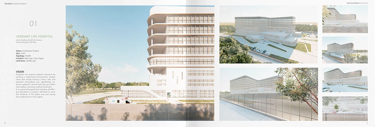
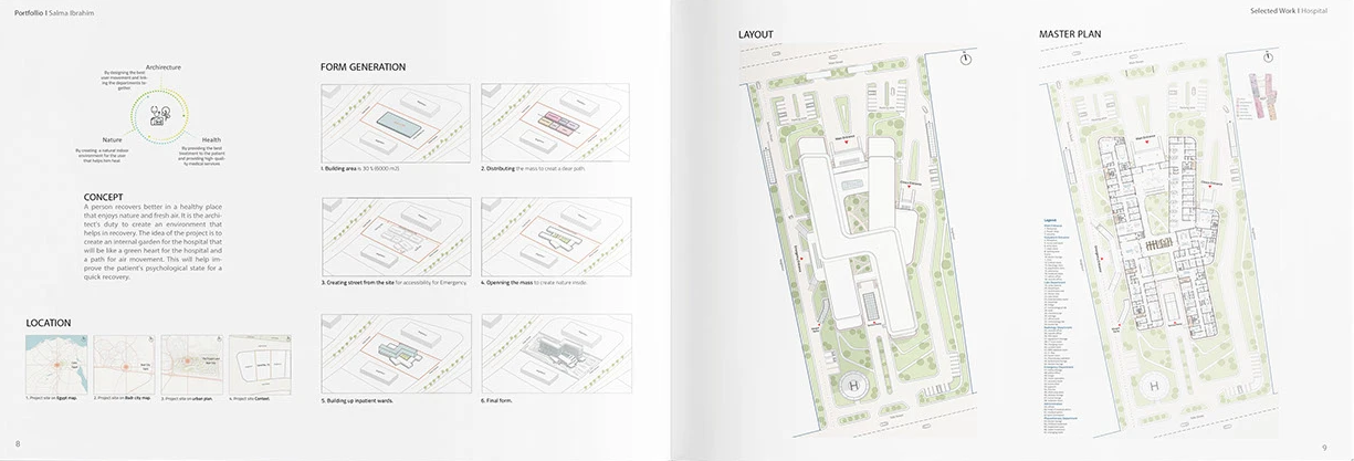
An example from Salma Ibrahim Hamed, of how you can dedicate space to a short explanation about the project that allows the reader to understand the background information prior to jumping into the main renders or floor plans.

NO CONTENTs PAGE
A potentially controversial point to end on but I think a contents page is an excellent way for an employer to see what you’re about.
It highlights your range of skills, tells them how you have structured your portfolio, and lets them jump straight to what interests them most, whether that’s a particular typology, a standout skill, technical drawings, or professional work experience.
It’s also your first opportunity to communicate narrative. The way you order and title your sections tells your potential future employer what you value and how you see your own development. It turns the portfolio into a curated journey rather than a random collection of projects.
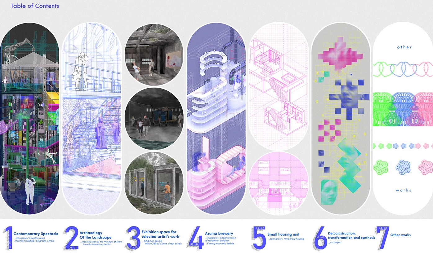
A stunning example from Tijana Gojkovic of how impactful a contents page can be to showcase a bit of all of your work right from the beginning of your portfolio.
Summary
So, to wrap this all up, a portfolio isn’t just a place to dump your work and send to every employer. It is a summary of who you are as a future Architect. It shows you work, what you value and how you present yourself, all before they get to meet you in person. (Once you secure that interview!)
After more than a decade of seeing the good and the bad, I can say with confidence that most of the issues above are completely avoidable with a bit of care and awareness. You’re not taught how to put together a professional, employer-ready portfolio at university, so don’t beat yourself up if you’ve made some (or all) of these mistakes, we all have.
What matters is that you start to see your portfolio as something curated, clear, and intentional. If you keep things clean, consistent, readable and give your projects the context and space they deserve, you’ll already be miles ahead of most applicants. And trust me, employers really do notice.
Thanks for reading! I hope this post helped you in way you needed it to!
If you’d like more guidance, I offer 1:1 tutorials available here or you have a question or a topic you’d like me to cover, drop me a message or fill out the form below - I’d be happy to write a blog post or create a resource to help you out!